For this week's assignment we asked to come up with a plane crash scenario with the main character walking away from the crash site.
The moodboard is based on various shots in different angels of 747; the angels range from take off, taxi and flight mode.
In this particular moodboard i was focusing on wreckages from the flight, I ws trying to focus on keying on the weak points of the plane and what ruble is left from an accident.
Key areas or "monuments" of NY however looking back at the brief these monuments of areas are mostly located in the centre of NY instead of East side of NY.
A blueprint of 747, the reason why I took this as a reference is because I wanted study the different angels to see how it looks.
This reference picture is very helpful because its gives an x-ray visual on the components of a 747 which is something that I can use to to volumise the crash scene and use the same components to express that dramatic events that will occur in my painting.
Video Links to Plane crashes in TVs and Movies:
Sketches of Airplane crashes, i wanted to analyse the different crash that have happened over the years and target the weak points of where the Plane has broken apart which are highlighted in red. This will help give the audience a "motion" capture as to what happened in the final stages of the crash before it came to a halt.
Sketches of airplane wreckages after the fire has been put out. these sketches are from the aftermath of the accident and the others are the pieces that have be scattered from the explosion.
This is a study of fire and smoke and understanding how the smoke and fire collaborate with each other during the first stage of explosion to the extended part of explosion where the smoke develops. Also it is the best part to capture what colours occur during the explosion; also how it behaves.
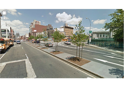
This composition is based near the Manhattan Bridge which is located in the East side of NY, the reason why i chosed this particular scene is because it is near the airport and the entrance of the bridge is could be taken as a "monument" type. The follow screenshot are from different angels of the street to capture the right angel.
Composition 1
Composition 2-1
Composition 2-1
Composition 2 Final

Composition 3
Composition 3-1
Composition 4
3D Composition 4 (Final Setting)
I used the 3d software to make a mimic scene of of my chosen composition "4" and used the 3d scene to help me place the wrecked Airplane into my scene which I can later use it as a reference.
Day Time Version

Night Time Version
My final pieces are very rushed however it gives the audience the impression of how brutal the plane crash was in the specific area. I like the rough, quick and sketchy painting style however i think in order to improve this piece i should ass some background paint to give it some depth.


.jpg)


.jpg)


